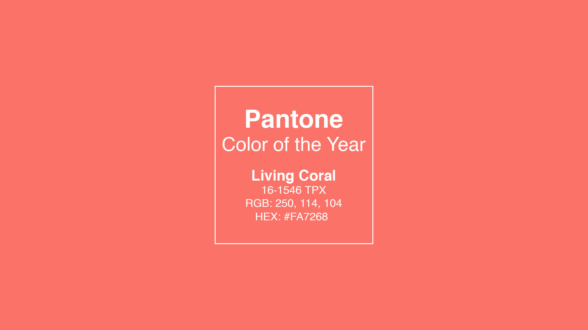
Pantone has announced their 2019 Color of the Year: Living Coral. And their choice for it, and the wording they’ve used in describing it (plus its name) seems to be a less-than-subtle nudge to our current affair…
Probably a strange color for the year, given it hits on an already dominant, and perhaps even fleeting, fad and trend. In discussing this with our fantastic graphic designers at work, there are plenty of other colors they’d have sooner expected to see pop up. But, a little reading into Pantone’s press release and why it was chosen comes to light quickly. Let’s start with this little bit from Pantone…
Just as coral reefs are a source of sustenance and shelter to sea life, vibrant yet mellow PANTONE 16-1546 Living Coral embraces us with warmth and nourishment to provide comfort and buoyancy in our continually shifting environment,
Alright, this is filled with goodness. First off, let’s start with the name. Living Coral… LIVING… CORAL. And in the quote above “continually shifting environment.” …
Good job Pantone- your message is read loud a clear! The Color of the Year is obviously a nod to climate change. Without saying the exact words, it’s about as obvious as can be. Our coral reefs are amongst the first ecosystems being destroyed by climate change. The color of the year is literally named Living Coral. And Pantone has slyly made verbal nods to a the “shifting” (changing) environment.
I love this. Climate change is a hotbed topic right now; probably because of the lack of belief in it in the White House. But, here were have one of the biggest companies in the printing industry, making a (less than) subtle nod to the topic.